
I am slowly but surely making progress on backing for the Layer Cake quilt. It is wonderful to get back into the sewing room without any other worries nagging in the back of my mind. Sometimes, I just cannot relax unless other chores, goals and whatnot are done around the house first. But, after the office purge was completed, I gave myself a week off to do whatever I please. This does not mean that I am neglecting the household chores though. I still cook dinner, do the laundry, etc., and etc. I am just not letting the other things get to me.
Anyway, I ironed and trimmed up the blocks for the lone strip going down the backing on Tuesday and Wednesday. But, before sewing the blocks up, I decided to do an exercise. I wanted to check on the color values. The way I did this was to take a picture:
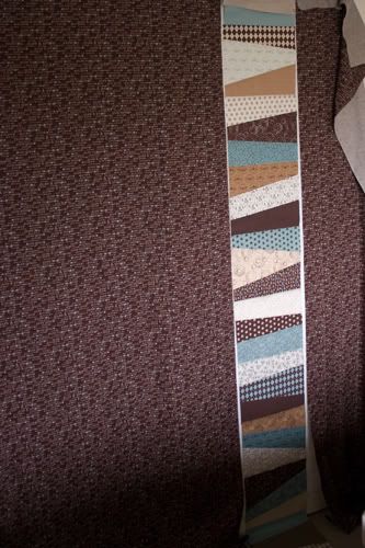
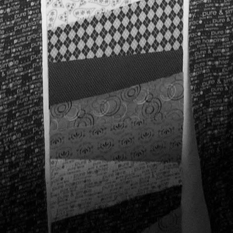
I then cropped the picture to focus only on the strip of blocks:
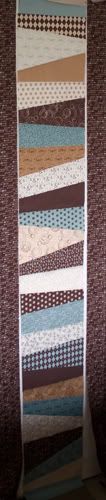
Take a look at the cropped color picture above. Do you see how that area looks "blah"? I believe this is due to the fact they are very close in tonal value in spite of the fabric having different colors (brown and blue). The only thing that seems to save this area is the slight difference in the scale of prints.
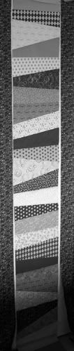
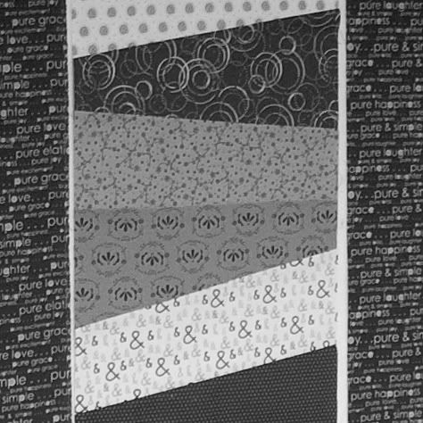
Now, on to the second problem area, which is near the bottom:
This exercise was valuable for future design of quilts. I think I will do this in the future for all the fabrics I choose for blocks and/or quilts before cutting into them. After all, I would want my quilt(s) to 'pop' instead of just being "blah". Also, I learned that I should not rely upon my instincts alone and use the tools that are available to us quilters. Yes, a camera is a tool.

I would have never thought of converting the photo to black and white. That really helps. I will do that on my next scrappy quilt. Most all quilting patterns say to divide up lights and darks, but I learned in decorating to do light, medium, and dark and the quilts look better with the three tones also.
ReplyDelete